Digital marketing is dynamic and unpredictable. What worked even a year ago on your website may not be the most effective method for attracting and converting visitors in today’s online environment.
Regardless of your marketing budget, here are 10 cost-effective, must-have features for your wedding website, according to Easy Weddings’ web designers who have created hundreds of business websites and online shops.
1. Optimised Contact Us forms
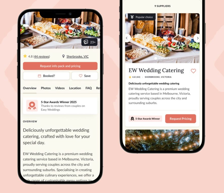
Displaying a phone number and an email address is no longer enough for brides who aren’t ready to pick up the phone – a Contact Us form is essential. If your form only has two fields you’re missing out on valuable information needed to provide brides with the most comprehensive quote possible.
In the time it takes you to play information ping-pong and extract additional information, they’re likely moved onto another supplier. A wedding business Contact Us form should include: Name, Phone Number, Email, Wedding date, Wedding location, How did you find us? and Your enquiry. With these details you can call prospects and provide an informed quote, significantly increasing your chances of securing a sale or booking.
2. SEO
One of the most effective ways to increase your site’s Search Engine Optimisation (SEO) is to regularly add keyword-rich content to your blog. It doesn’t have to be 1500-word articles every other day; a variety of content can encourage search engines to crawl your site and attract backlinks – if you’re promoting posts effectively.
Images and videos are less time-intensive to share, and if tagged appropriately, search engines will be able to index and present them in search results for people seeking that information.
3. Mobile responsive
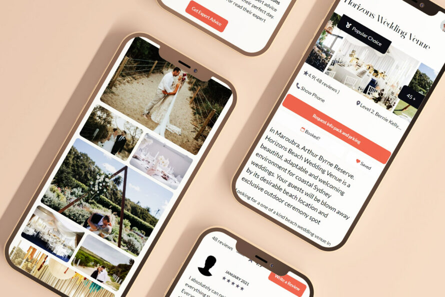
Today, up to 40% of website traffic is likely to be from a mobile device. According to our statistics, that figure is even higher among Easy Weddings’ brides.
As more sites are adopting mobile-friendly designs, consumers are becoming less tolerant of non-responsive websites that force them to scroll endlessly to find content and zoom in to complete forms or select buttons.
Having a responsive site with adaptive screen widths and scalable images will reduce the bounce rate (people leaving your site before taking a look around) and increase the time people spend perusing your products or reading about your services.
4. Social media icons
Everybody knows what social media icons look like and that’s what their eyes are scanning for when they land on your site.
Don’t hide your social media accounts down the bottom of your page in the footer as a hyperlinked word that fades into a sea of links. People have grown accustomed to clicking on a form of the lower case ‘f’ which they know will take them to a Facebook Page, so if that’s what they’re looking for, put it on every page and make it easy to find it!
5. Testimonials
Reviews from real-life brides who have gone before are powerful selling tools. People can be overwhelmed by choice with wedding vendors, so when confronted with the similar services at comparable prices, consumers are more likely to enquire on the site with testimonials and pictures of happy brides who’ve used the service before.
And, of course, don’t forget to get them to review your service on Easy Weddings where your ratings will be displayed on your profile.You can also call your Account Manager and have them help you add a Reviews widget onto your website, so that all your Easy Weddings reviews are visible on any page of your site that you wish them to appear on.
Customers They’ll even go into the running to win an iPad!
Don’t be afraid to ask customers for reviews and testimonials. You can also use thank you notes posted on social media. Send the client a quick message and confirm they’re OK with you using their testimonial and add it to your website.
Regularly adding/updating testimonials will also boost your SEO.
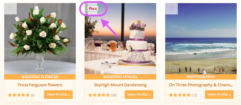
6. Pin It buttons for business
There is not a wedding business around that doesn’t have a single photo on their website. If you don’t, then you’re doing it wrong and your business is, no doubt, suffering.
From wedding photographers and formal wear hire to celebrants and invitations; every website needs professional images and should consider adding a Pin It button to their pages to encourage visitors to save these pics onto their wedding ‘Pinspiration’ boards. It’s great for SEO and increases the chances of other brides finding your site.
7. Meet the team
You can’t get much more personal than a wedding. It’s a bride’s big day to have everything her way and be supported by vendors who will ensure it goes exactly to plan.
This involves having a team of people you can trust. If you’re a photographer, celebrant or makeup artist, YOU are the product! Add team profiles to your website to show brides the smiling faces they’ll be dealing with and include short bios detailing your experience and passion for your work. Team profiles make you appear accessible and approachable, and clients need to know they can reach out to real people when they need you most.
8. Calls to action
You might have a website with lots of pretty pictures, but unless people know exactly what to do when they arrive on your site, they’ll leave without taking action. This action can be booking an appointment, making an enquiry, purchasing a product, signing up for a newsletter or following on social media. Decide what’s most important on each page and make it crystal clear what visitors need to do with strong calls to actions in headings, buttons and closing paragraph text that pave the way to conversion.
9. FAQs
Adding a Frequently Asked Questions page to your website can considerably reduce time spent replying to enquiries. It will also equip brides with more information to bring them closer to conversion at the point of enquiry. If they can find out how far in advance they need to book, what the deposit is, the minimum number of people for booking, what’s covered by your insurance, additional fees for public holidays and the refund policy all before picking up the phone, they will be closer to the point of conversion or appointment by the time they pick up the phone and call – all you need to do then is work your charm!
10. Search box
Visitors to your website are as pressed for time as you are, so be sure to include a search box for those wanting to avoid trawling through every page on your site to find what they’re after.
Even websites with highly intuitive navigation and organised pages can benefit from adding a search box that helps visitors find what they’re looking for in the shortest time possible. And while we hate to point out the obvious, don’t make people search for the search box. Put it somewhere obvious on the landing page above the fold where visitors eyes will land – generally the top right of the page.
Gal Opatovsky, our head web designer, believes if your site is more than three years old, it’s probably time for a polish and shine. Check out the Easy Weddings website design portfolio to see some of Gal’s finest sites and call our Customer Care team on 1800 155 122 to enquire about our website design packages, including mobile-friendly design, two years’ domain registration and 12 months’ Australian-based hosting.
Not sure where to start improving your wedding website? Leave the URL in the comments and our design team will be in touch with some ideas!


